Menu

Emily Abrego

_

Skip to content
  • Home
  • Contact

Unknown's avatar emabrego 8:16 am on April 16, 2019  

Week 11: Color Contrast

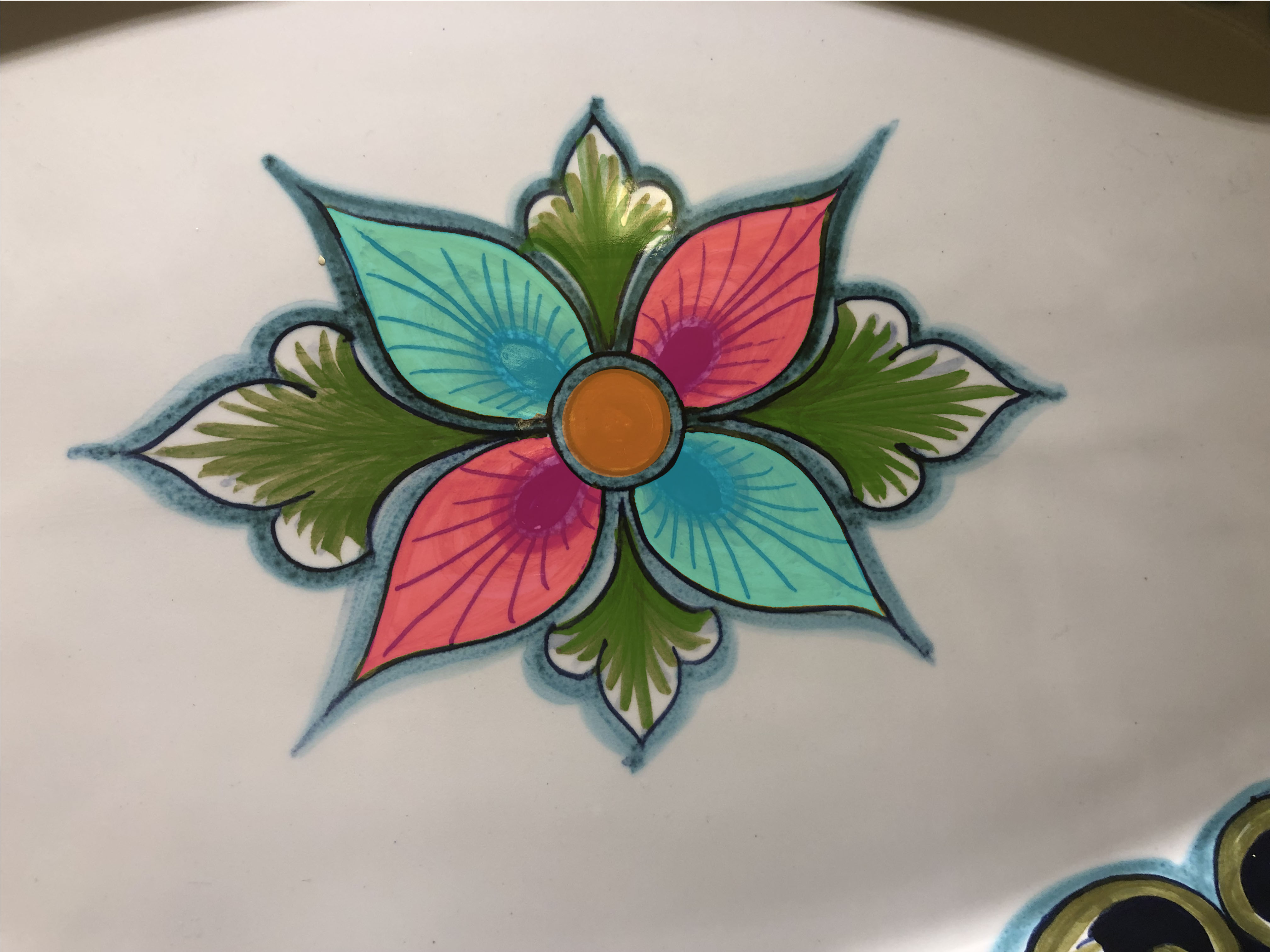
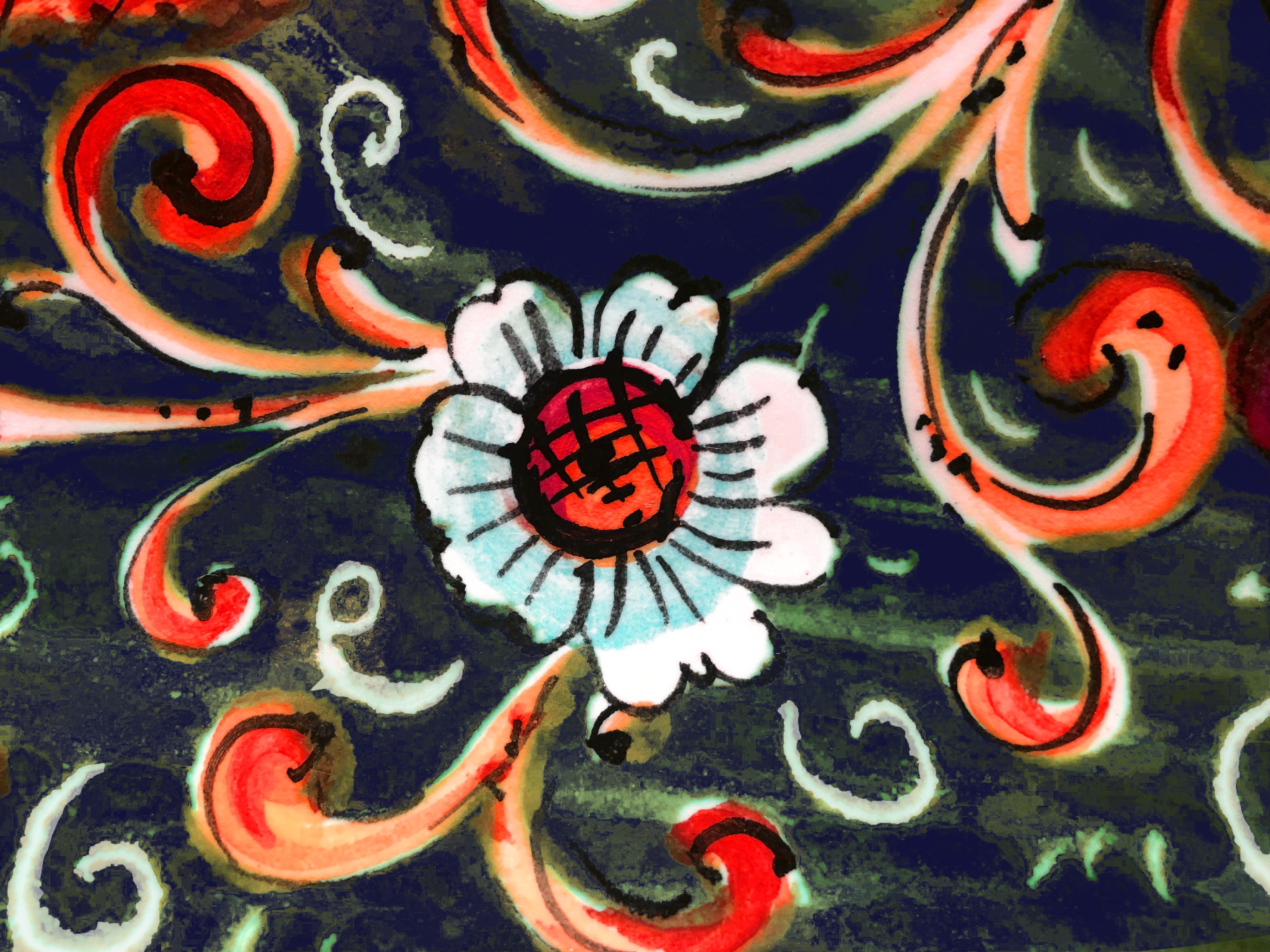
Sinhee and I created the first image using the warm and cold contrast to make the colors and hues of the image pop out. During lab time I changed the hue and some of the colors in the second picture, I prefer the second design because its visually pleasing.

Share this:

  • Share on X (Opens in new window) X
  • Share on Facebook (Opens in new window) Facebook
Like Loading...

Related

Leave a Reply Cancel reply

Your email address will not be published. Required fields are marked *

Post navigation

← Week 9 & 10: Color Harmonies and Photoshop. Podcast Response
Final Design →
Create a free website or blog at WordPress.com.
Privacy & Cookies: This site uses cookies. By continuing to use this website, you agree to their use.
To find out more, including how to control cookies, see here: Cookie Policy
  • Comment
  • Reblog
  • Subscribe Subscribed
    • Emily Abrego
    • Already have a WordPress.com account? Log in now.
    • Emily Abrego
    • Subscribe Subscribed
    • Sign up
    • Log in
    • Copy shortlink
    • Report this content
    • View post in Reader
    • Manage subscriptions
    • Collapse this bar
Loading Comments...
%d
    Design a site like this with WordPress.com
    Get started